VERSION 1.0
Brand Style
Guidelines

- 03Logo Overview
- 07Brand Icons
- 09Brand Colors
- 11Typography
- 13Logo Usage
01
Logo
Overview.
Logo
Construction

Corporate logo
& brandmark
Logo symbol

Logo title
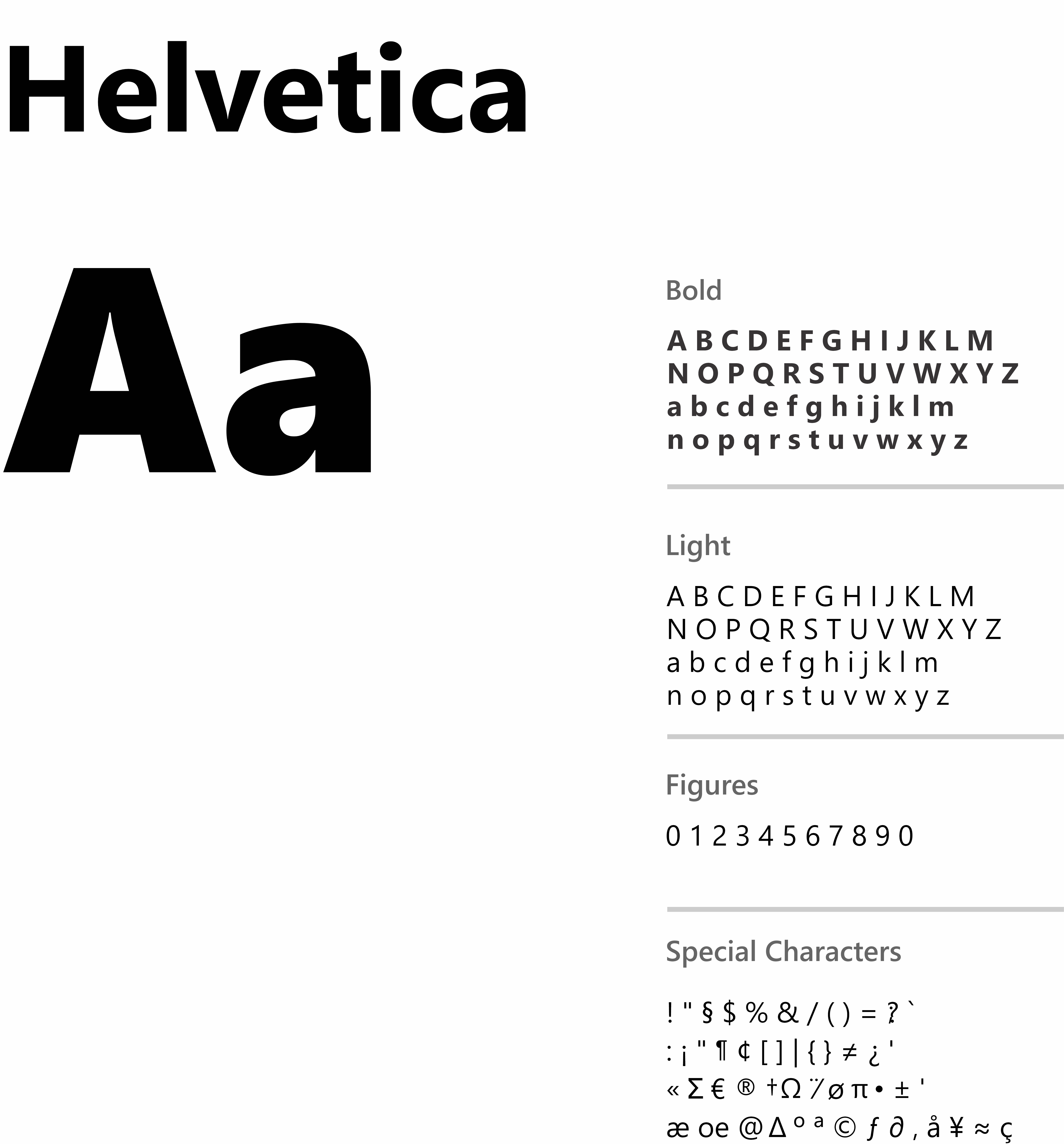
Carefully chosen for its modern and refined,
highly legible style, The font that is used here
is Helvetica

The full logotype
A combination Logo. The Corporate Logo
comprises two elements, the logo symbol
and logo type.

Logo with tagline

Other
Variations



02
Brand
Icons
Brand
Icons
03
Brand
Colors
Colour
Palette
Primary
#014FDF
R:1 G:79 B:223
C:91 M:73: Y:0 K:0
Secondary
#152026
R:0 G:0 B:0
C:80 M:67: Y:62 K:84
04
Typo
Graphy
Primary
Typeface
05
Logo
Usage
Usage on
backgrounds

On light backgrounds

On white backgrounds

On coloured backgrounds

On dark backgrounds

On backgrounds with images
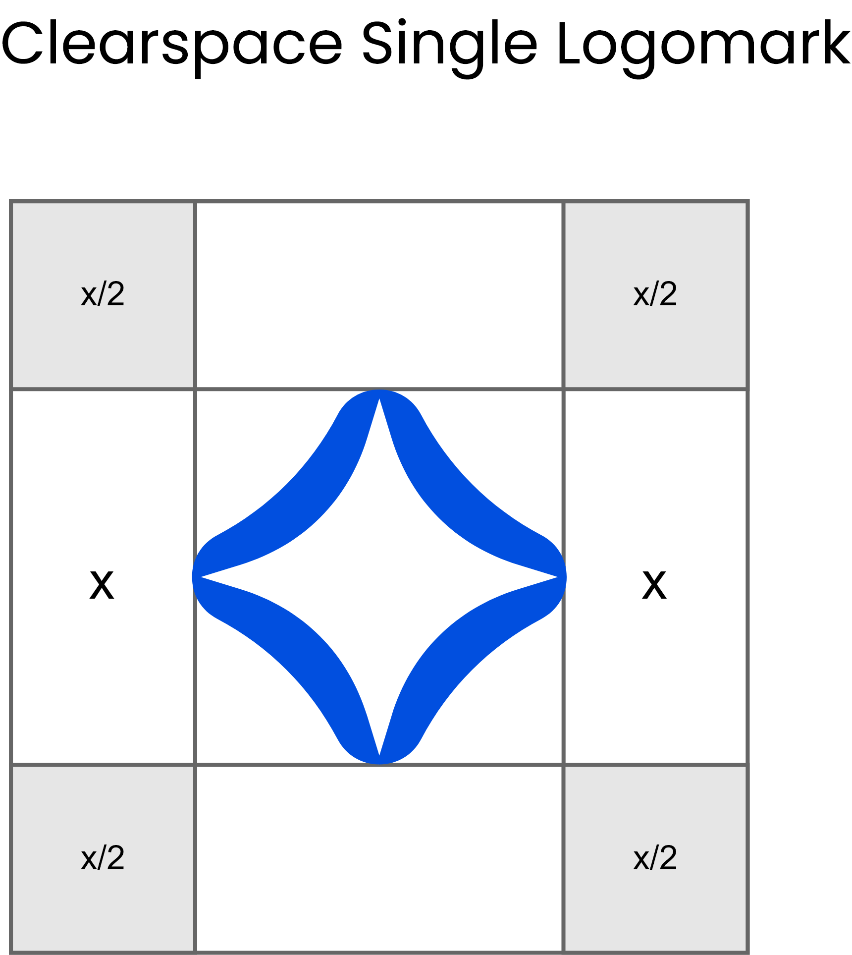
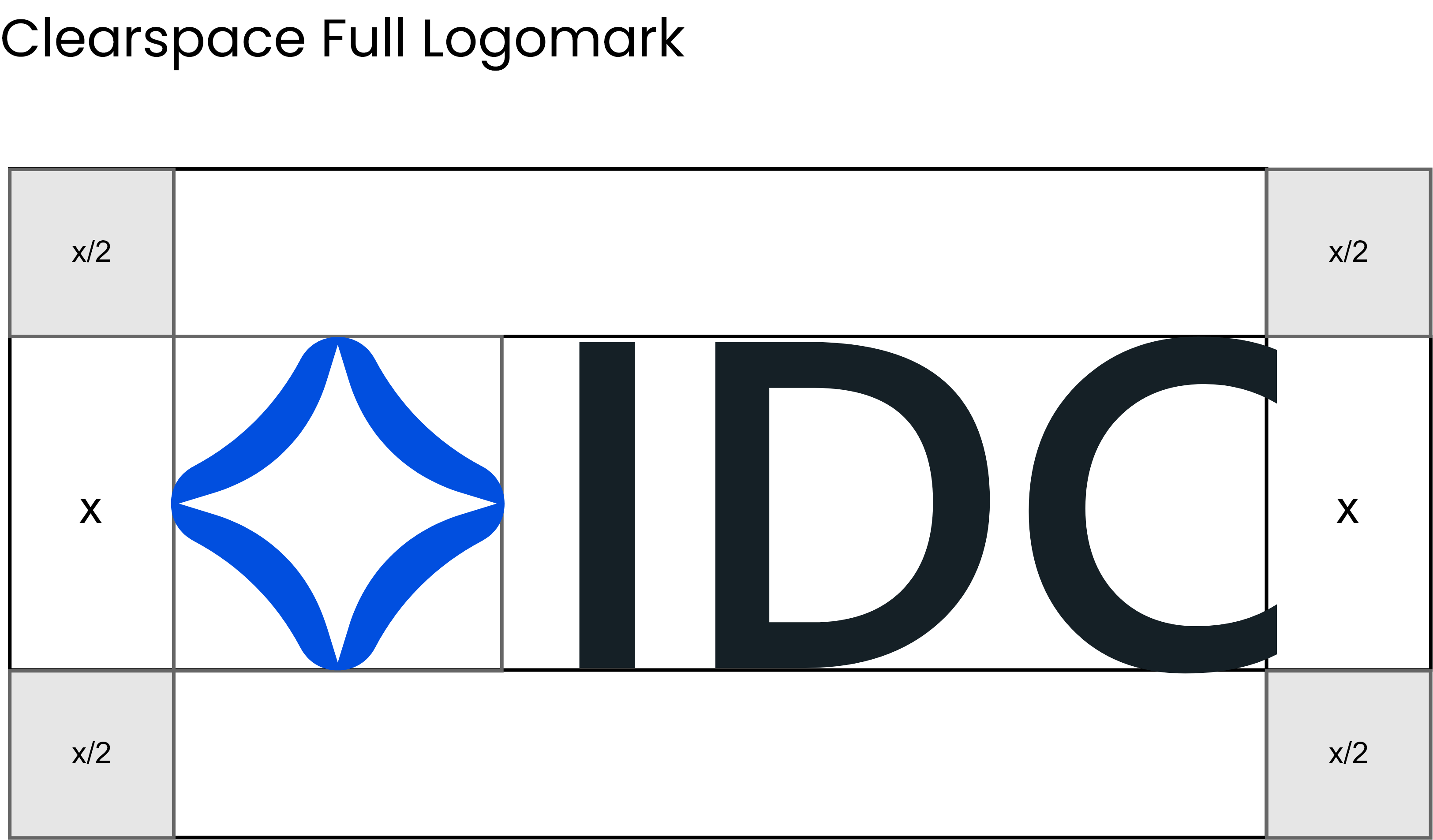
Logo Clearspace
and Computation
Whenever you use the logo, it should be surrounded with clear
space to ensure its visibility and impact. No graphic elements
of any kind should invade this zone.
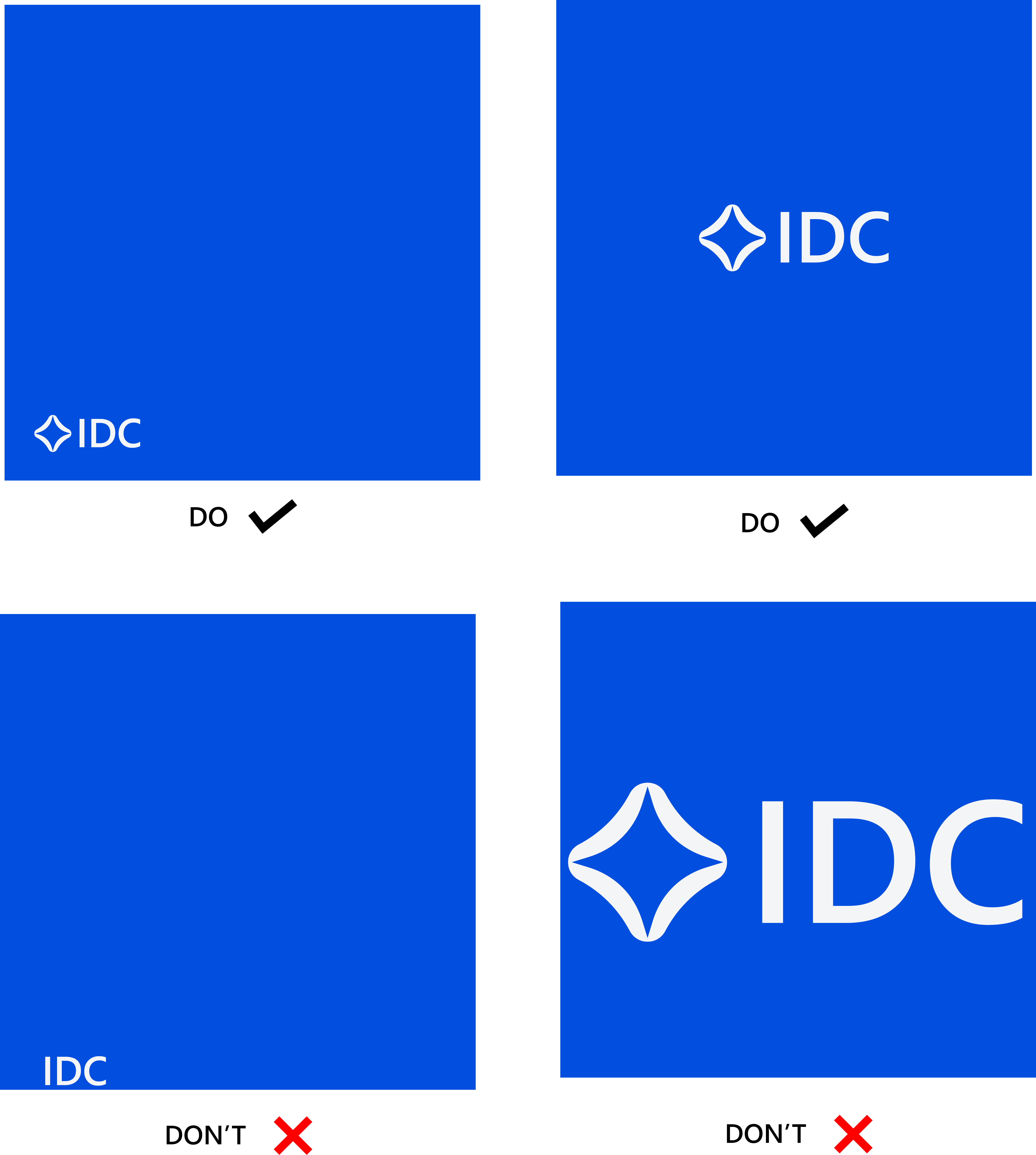
Logo Placement
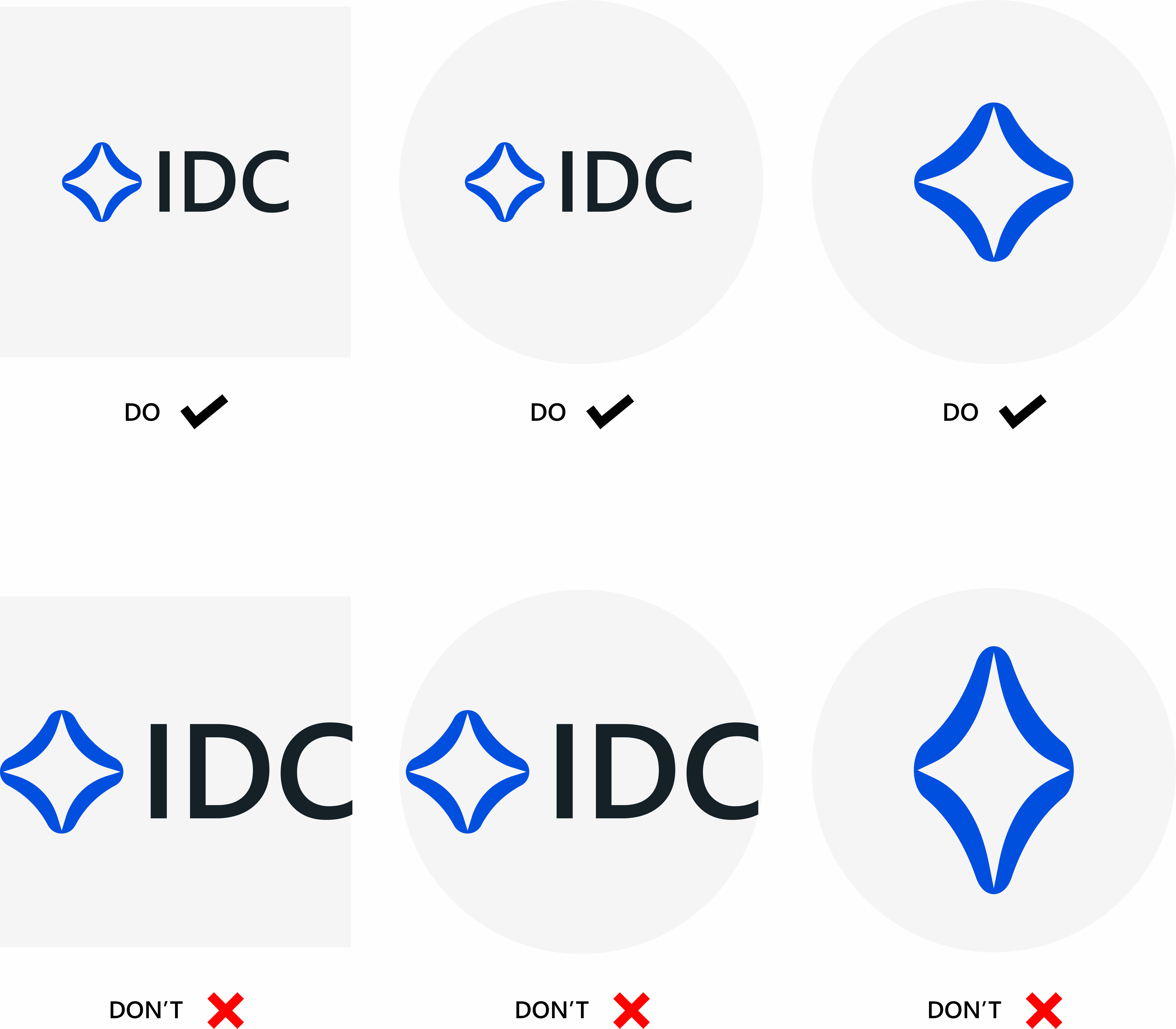
Dos and Don’ts
Good white spacing around your logo makes
it more appealing and balanced to the eye.
On Display Pictures
On Banners
Brand Style
Guidelines
